Designing the Bescy NYC Event Poster
From blank canvas to a vibrant community event flyer — a three-person collaborative design process.
3-Person Team · Visual Identity · Canva · Event Poster Design · 2026
My role: Co-lead of Bescy NYC
Timeline: 1 month
1 Gathering Inspiration — Scanning the Landscape
The project began with a structured visual research phase. As a three-person team, we wanted to align our aesthetic references before any design decisions were made. We scanned 8–10 existing business and guest speaker event posters from Canva, selecting examples that spanned a range of tones — from minimal and corporate, to warm and colorful, to bold and editorial.
Rather than defaulting to one person’s taste, we pooled our searches into a shared reference bank, ensuring diverse aesthetic inputs from the start. This avoided anchoring too early on any single direction and made the eventual consensus feel earned, not imposed.
2 Element-Level Critique — Noting Likes and Dislikes
For each reference, the team documented exactly what was working and what wasn’t — at the element level, not the gestalt level. A poster might have a layout we loved but typography we’d discard, or a color palette we’d keep alongside a hierarchy we’d restructure entirely.
By being granular, we built a shared vocabulary of design preferences that could survive disagreements about overall templates. Each slide captured the poster alongside a structured ‘Notable Features’ table — keeping critiques specific and actionable.

Our team’s element-level critique format — each reference paired with a Notable Features table calling out specific strengths and challenges. This kept feedback concrete and prevented vague aesthetic disagreements.
| ✓ Kept | ✗ Dropped |
| Bold headline placement | |
| Speaker photo prominence | |
| Color-blocked detail sections | |
| Iconographic event details |
3 Building Consensus — Defining a Priority Hierarchy
With a full picture of what we liked and disliked, the team moved into a structured prioritization exercise. We made explicit decisions about what should command visual weight and what could be secondary — forcing real trade-offs rather than trying to do everything at once.
| High Priority | Secondary |
| ● Talk title | ○ Speaker bio paragraph |
| ● Speaker name | ○ Company name |
| ● Event logistics | ○ Bescy brand copy |
| ● Speaker photo | ○ Social handles |
Blue = high visual priority · Gray = secondary / suppressed
4 Deciding the Energy — Warmth vs. Business vs. Hybrid
One of the more nuanced team decisions was agreeing on emotional register. Bescy occupies a unique space — it’s rigorous (behavioral science) but deeply people-first (global community, accessible knowledge). We discussed three directions before arriving at a decision.
| WARM / CREATIVE Expressive and approachable — but risks feeling too informal for a science event. | BUSINESS / INSTITUTIONAL Clean authority and credibility — but risks feeling cold and forgettable. | HYBRID ✓ CHOSEN Business structure with warm creative accents. The pink photo outline defined this direction. |
5 Anchoring in Brand — Working with the Bescy Color System
With tone and priority hierarchy settled, we grounded the design in Bescy’s established color palette. These three colors became non-negotiable — no pastels, no neutrals, no dilution of brand identity. All design decisions would need to work in dialogue with this palette.
| Pink #fb0efb | Blue #3955ff | Aqua #04feff |
The gradient background (aqua flowing downward into a lighter tone) emerged naturally from these: it gave the poster visual depth and movement while keeping the upper title area clean and high-contrast for readability.
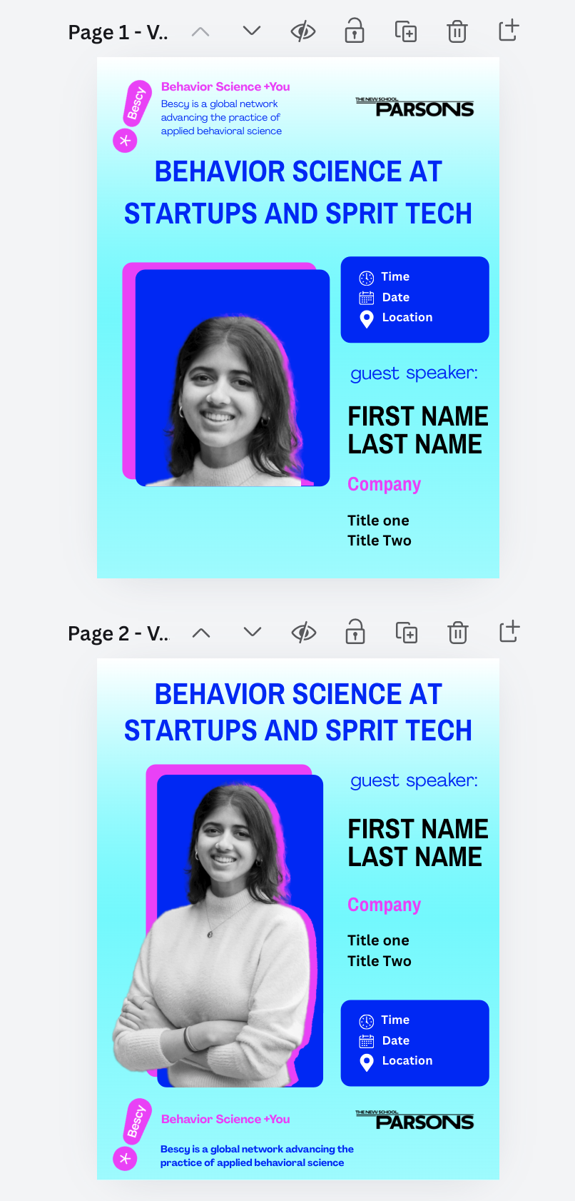
6 Building the Template — Four Layout Iterations in Canva
With all major decisions aligned, I moved into template construction in Canva. The layout logic reflected the priority hierarchy directly — what ranked highest got the most visual real estate.
Four distinct layout versions were created to pressure-test remaining unresolved questions:
- Should the Bescy branding sit above the title, or anchor the bottom of the poster?
- Should the location’s branding sit above the title, or anchor the bottom of the poster?
This variable had a significant effect on where a viewer’s eye traveled first.
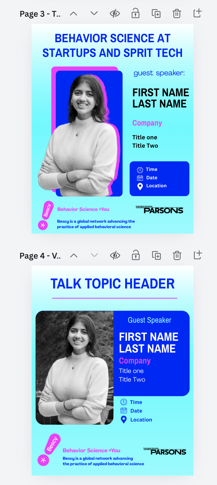
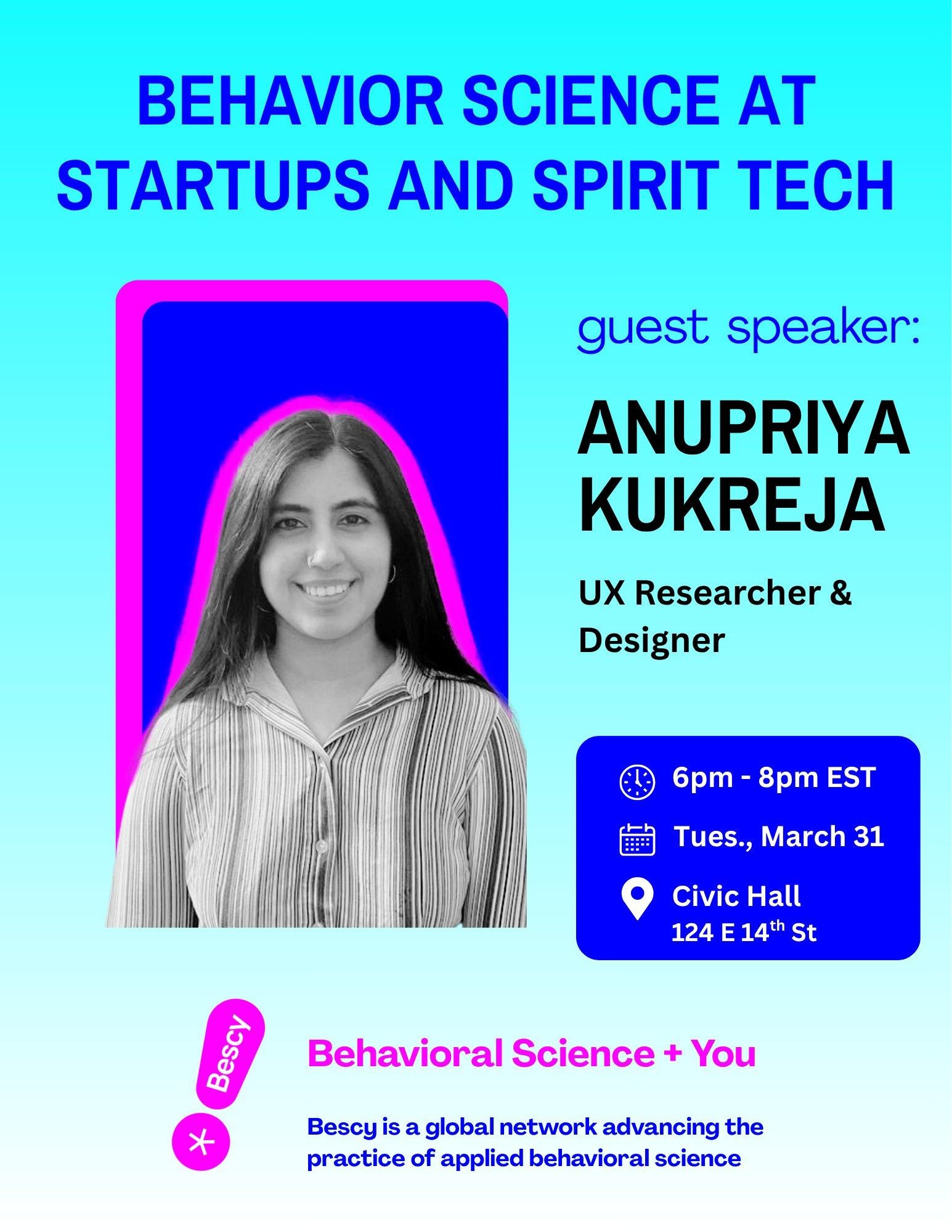
7 The Final Poster — Landing on the March Design
After reviewing all four versions together, the team converged on a direction closest to pages 2 and 3, ensuring the topic leads more than the branding, with one final refinement: the background gradient was applied downward, so the title area reads bright and crisp. At the same time, the footer naturally grounds the composition.
The final poster resolved every tension the team had discussed throughout the process. Each design element maps directly back to a decision made earlier in the sprint.
✓ Title at the top — maximum scannability; the talk topic leads
✓ Pink speaker outline — warmth and creativity over a cold headshot
✓ Aqua-to-light gradient — brand-led but breathable and energetic
✓ Details box in blue — high contrast, icons enable rapid scanning
✓ Branding at the bottom — present and consistent, without competing
✓ Speaker name large — the person is the draw, not just the topic
“What made this process successful wasn’t any single design decision — it was the order of decisions. We aligned on priorities before touching a tool, on tone before touching color, and on structure before touching layout. By the time we opened Canva, we were solving execution problems — not alignment problems.”
— Anupriya Kukreja, UX Researcher & Designer
