Plumbum — Designing for Writers to Build Confidence in Their Voice
Role: Chief of Product (0 → 1 UI and UX)
Scope: Research, Product Strategy, UX Architecture, Mid-Fi Prototype
Stage: MVP
Timeline: 2 months
The Origin Story
Context
While working as Marketplace Manager at Sol, I conducted surveys and focus groups to understand why spiritual guides weren’t converting, and found the core bottleneck wasn’t marketing but emotional resistance to consistent self-expression.
Guides struggled with posting regularly, self-promotion, and clarity of voice—issues that directly impacted conversion.
At the same time, I was building PenPal to address this through behavioral nudges, shaped by my own long-standing inhibition around sharing writing.
Then I (very coincidentally) met Sol (founder of Plumbum), who was building a platform to solve a similar problem from a different angle: helping writers build confidence in their voice through community.
This was when we decided to join hands.
PlumBum
Plumbum is a community-centered writing platform designed to address creative isolation and cultivate meaningful connections among writers.
The platform’s vision:
Writing as practice, not performance.
Community through shared work, not noise.
The founder had validated the concept through:
- 110+ registered users
- Recurring workshops
- Creative-tech mixers with ~50 attendees
My role began at the inflection point:
Transitioning from community + website into a scalable product experience (iOS app).
1. The opportunity
Plumbum is a writing community before it is an app. Members apply to join, attend in-person workshops in NYC and online sessions, and share work that is often personal, religious, or politically charged. My job was to build an interface that earned trust before asking for vulnerability — and that scaled the founder’s curatorial instinct (“community first, not algorithm first”) into product surface.
Design bet: Treat the membership application form as the first piece of UX research. Every applicant becomes a data point, and every data point becomes a design decision.
2. Research — the survey lived inside the website application form
Rather than running a separate survey, I embedded the research questions directly inside the website’s membership interest form. Anyone interested in joining Plumbum had to answer them to apply, which gave me a high-signal sample of real prospective members instead of generic respondents.
Form structure (4 paginated steps)
- Step 1: Genres (multi-select chips), comfort sharing (1–5 scale), feedback frequency (Daily → Rarely).
- Step 2: Artist statement — open text on “what would make a writing space meaningful for you?” and “what do you look for in a writing community?”
- Step 3: Format preference (in-person / online / both), how they heard about Plumbum, and an open text “what features would make a writing platform most valuable to you?”
- Step 4: Biggest writing goal and biggest struggle as a writer (open text).
Why this worked
- 100% of respondents were qualified leads — they were applying to join, not idly answering.
- Open-text fields gave me language I could lift directly into UI copy and feature naming.
- Quantitative chips and scales gave me a defensible ranking of features and behaviors.

Step 1 of the website interest form: format preference, how they heard about PB, open-text feature wishlist.
")
Step 2: Artist statement — open-text fields that gave me coded themes for community and meaning.

Genres, sharing comfort, and feedback frequency — the quantitative scaffolding behind the qualitative answers.
3. What the data told me
I theme-coded the open-text responses and ranked the multi-select chips. Six insights drove every downstream design decision.
Insight 1 — Community & belonging beat every other motivation

Community & belonging (27%) and feedback & craft growth (23%) were the top two reasons writers wanted in. Publishing was almost an afterthought (6%).
Design implication: Lead the home surface with “what’s happening in your communities,” not a feed of trending posts. Defer publishing-style affordances; foreground belonging cues first.
Insight 2 — Honest, constructive feedback is the #1 community trait

Honest/constructive feedback (25%), genuine connection (19%), and a safe judgment-free space (15%) made up nearly 60% of all themes.
Design implication: Build an annotation UI that supports line-level, considered feedback — not just a comment thread tacked under a post.
Insight 3 — Feedback / annotation tools were the #1 feature ask

Feedback/annotation (21%) led every other category. Goal tracking, event discovery, and writer discovery tied for second.
Design implication: Treat the annotated reading view as a first-class screen, not a comment overlay. Dedicate the Studio area to drafts, workshops, and feedback states.
Insight 4 — Poetry dominates the genre mix

Poetry was nearly 2x the next genre. Fiction, short stories, and non-fiction filled out the mid-tier; screenwriting and memoir were the long tail.
Design implication: Default the writing prompt feed and community suggestions to poetry-leaning content, but build the create flow to handle long-form (Fiction, Books, Collections) without friction.
Insight 5 — Writers are already comfortable sharing

59% rated their comfort 4 or 5 out of 5 — only 7% sat below a 3.
Design implication: Don’t over-engineer privacy gating. The default state can be “draft → share to community” in two taps. Keep Private and Anonymous as deliberate options, not defaults.
Insight 6 — Feedback-seeking is bursty, not constant

“Occasionally” (25%), “Weekly” (20%), and “Monthly” (20%) led. Only 7% sought feedback daily.
Design implication: The notifications and “what’s new” feed should reward weekly check-ins, not punish missed days. No streak gamification.
4. Mid-fidelity — translating insights into the onboarding flow
Figma draft 1 was where the research became a product. I designed an onboarding flow that mirrored the website application (so app-first applicants weren’t penalized), respected the gated-community decision, and surfaced the brand pillars before asking for any commitment.
4.1 Entry — brand pillars before the ask
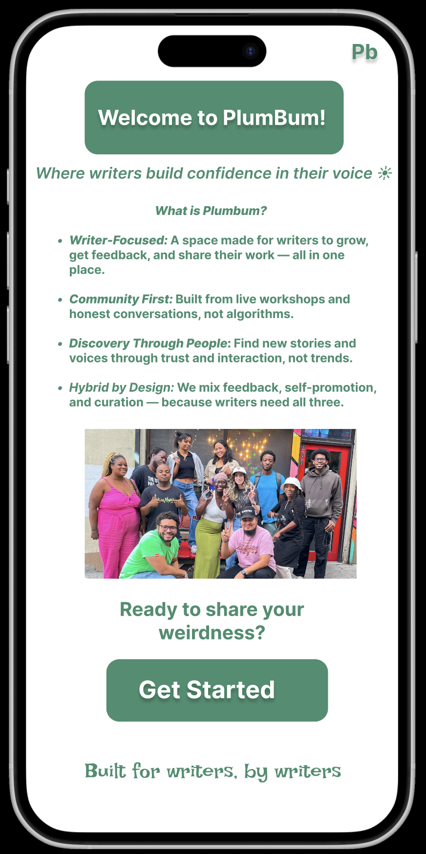
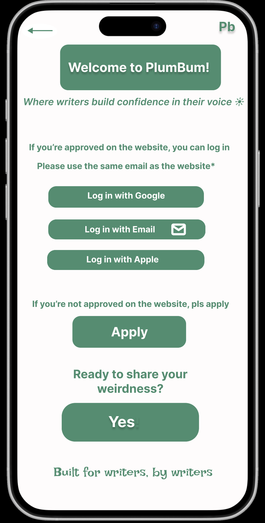
| Download / entry page — four brand pillars (Writer-Focused, Community First, Discovery Through People, Hybrid by Design) frame the “Get Started” ask. | Sign-up onboarding — SSO for approved members, an “Apply” path for everyone else. The gate is honest about itself. |
4.2 In-app survey — mirroring the website form
App-first applicants saw the same questions as web applicants. This kept the data set clean and the bar to apply consistent.
Experience level and current writing goals (multi-select). Goals double as later personalization signals.


Sharing comfort, feedback frequency, and format preference — mirroring the website form so data sets stay comparable.

Open-text vision and struggle questions, followed by the explicit “you will hear back from us” state — the gate, made obvious.
4.3 Personalization — community suggestions from genre
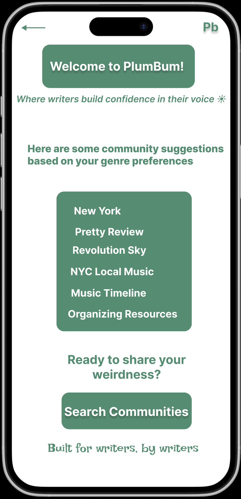
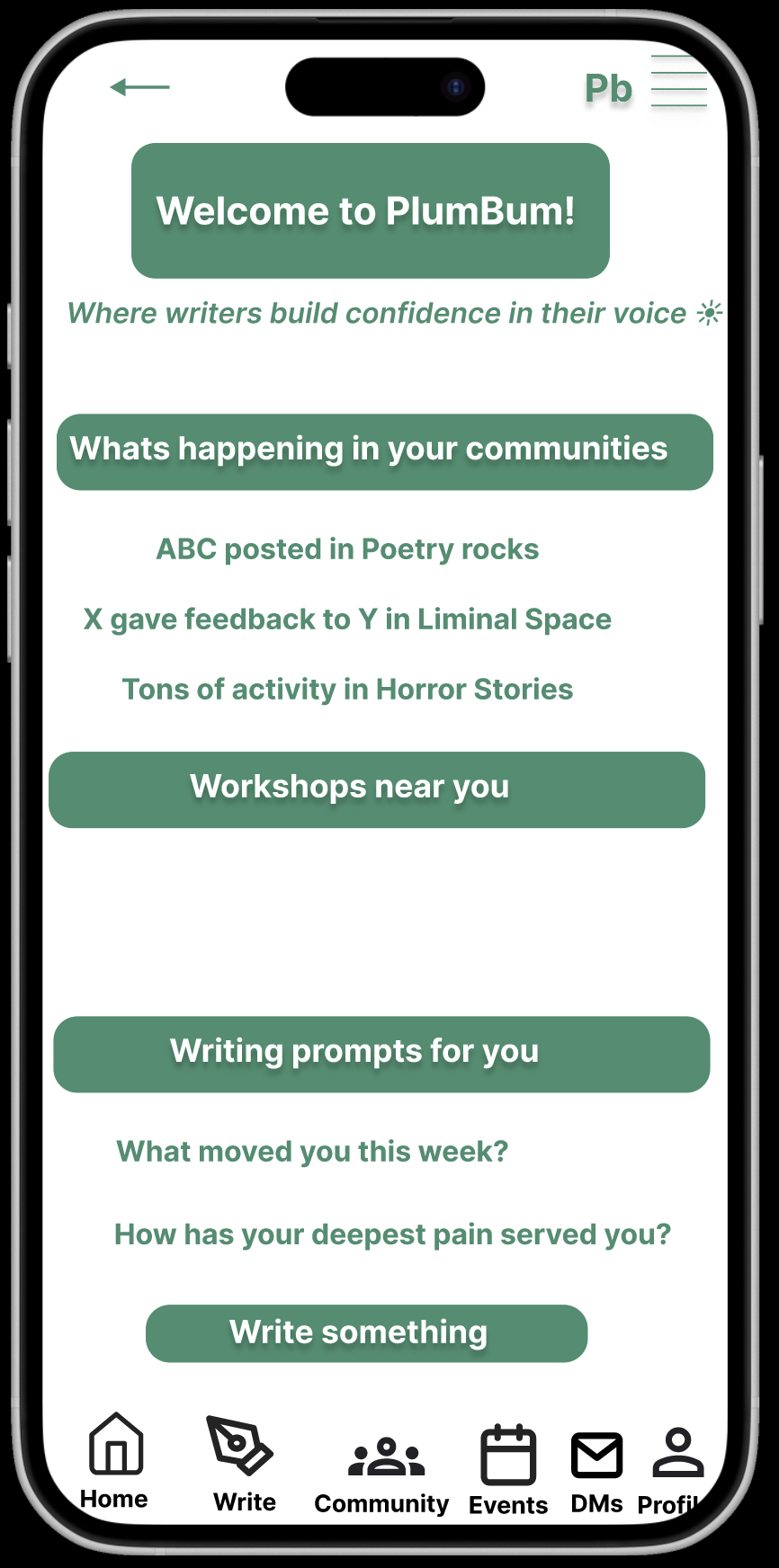
| Community suggestions matched to genre preferences — the first time the survey data shows up as product. | Mid-fi home: “What’s happening in your communities,” “Workshops near you,” and “Writing prompts for you” — directly mapped to insights 1, 2, and 4. |
4.4 Information architecture — Taxonomy v1

First IA pass: Pages are the atom; Books and Collections aggregate Pages; Libraries hold Collections; Workshops and Archives sit alongside. This was the structure I tested with members before locking the dashboard layout.
5. What shipped — PB on Testflight
The shipped UI tightened the mid-fi into a coherent green-on-cream system. Two structural moves carried the most weight: (1) splitting Home into a community feed and a personal Dashboard, and (2) elevating the annotated reading view from a comment thread into a first-class surface.
5.1 Home + Dashboard — the community/self split
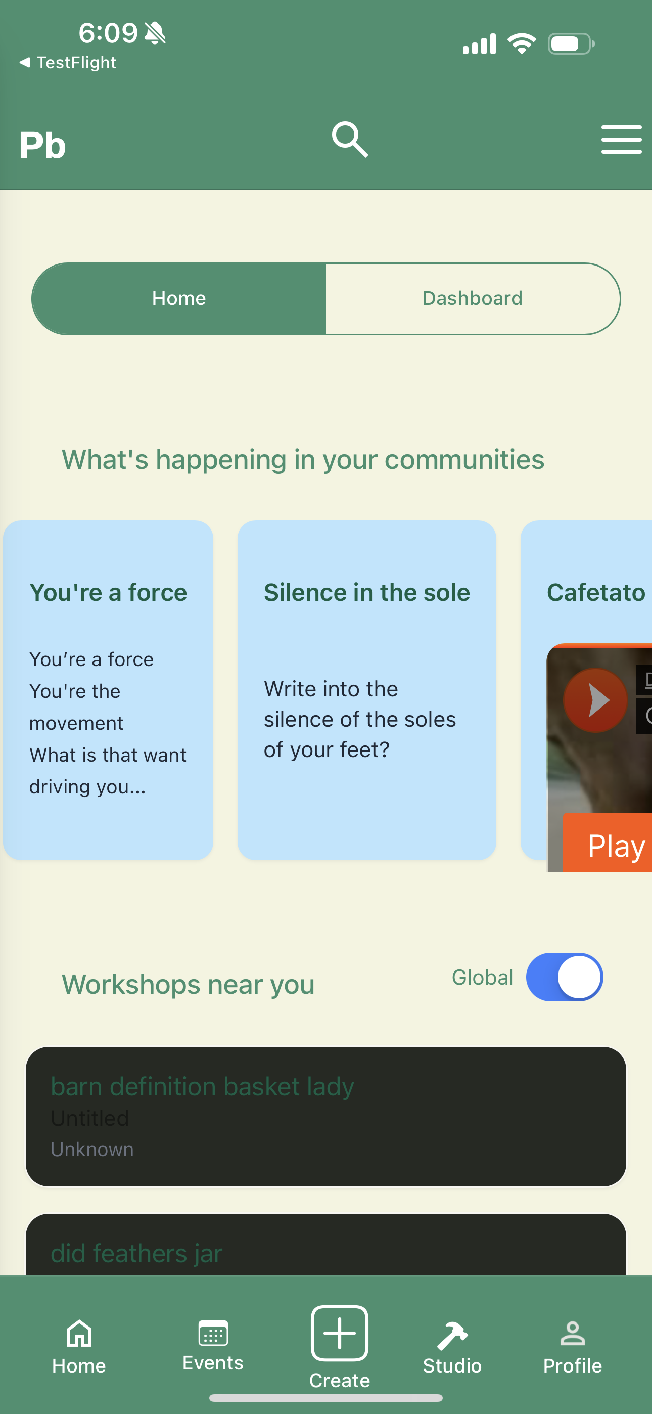
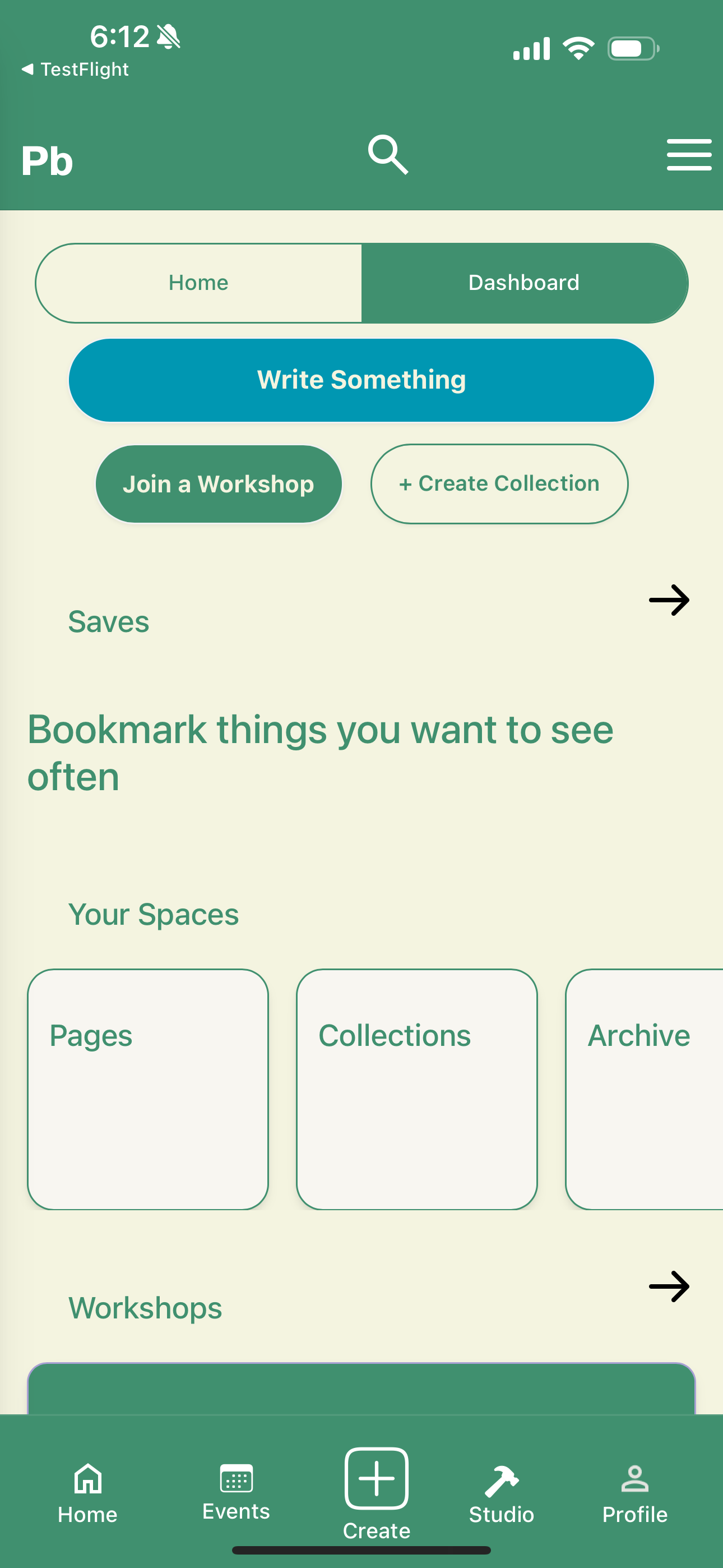
| Home: “What’s happening in your communities” as horizontally-scrollable cards, “Workshops near you” with a Global toggle. Bottom nav: Home, Events, Create (FAB), Studio, Profile. | Dashboard: a personal workspace — Write Something CTA, Join a Workshop / Create Collection, Saves, and Pages/Collections/Archive cards. |
Why the split In mid-fi I had one feed doing two jobs: showing community activity and surfacing the writer’s own work. Members in usability sessions kept asking “where are MY pages?” — so I split the surface. Home stays social; Dashboard is the writer’s desk.
5.2 Prompts and the “What’s new” feed
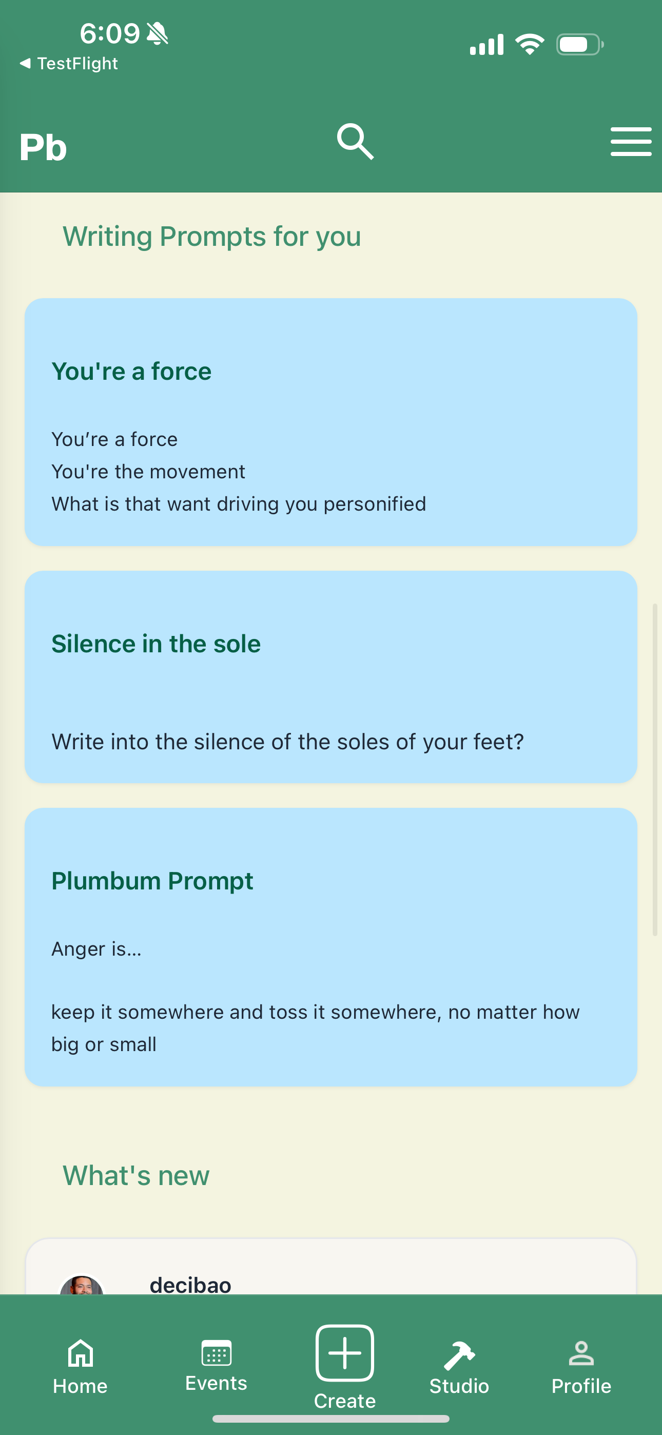
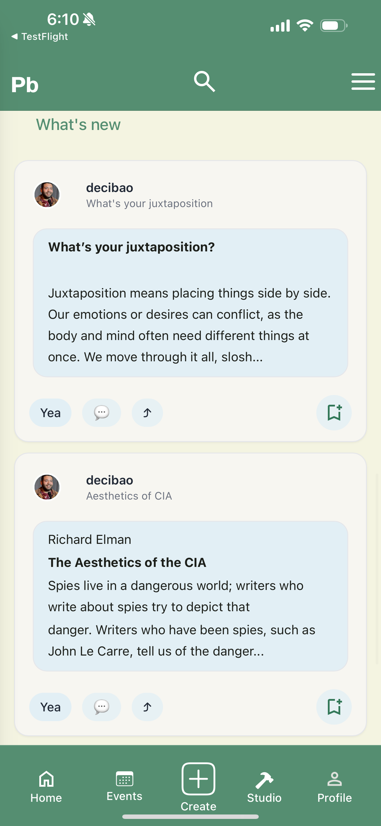
| Writing prompts — the poetry-skewed default content (“write into the silence of the soles of your feet”) directly serves the genre mix from Insight 4. | “What’s new” — community posts as cards, with “Yea,” reply, and bookmark affordances. Designed for weekly check-ins, not daily streaks (Insight 6). |
5.3 Annotated reading + comments — the feedback surface
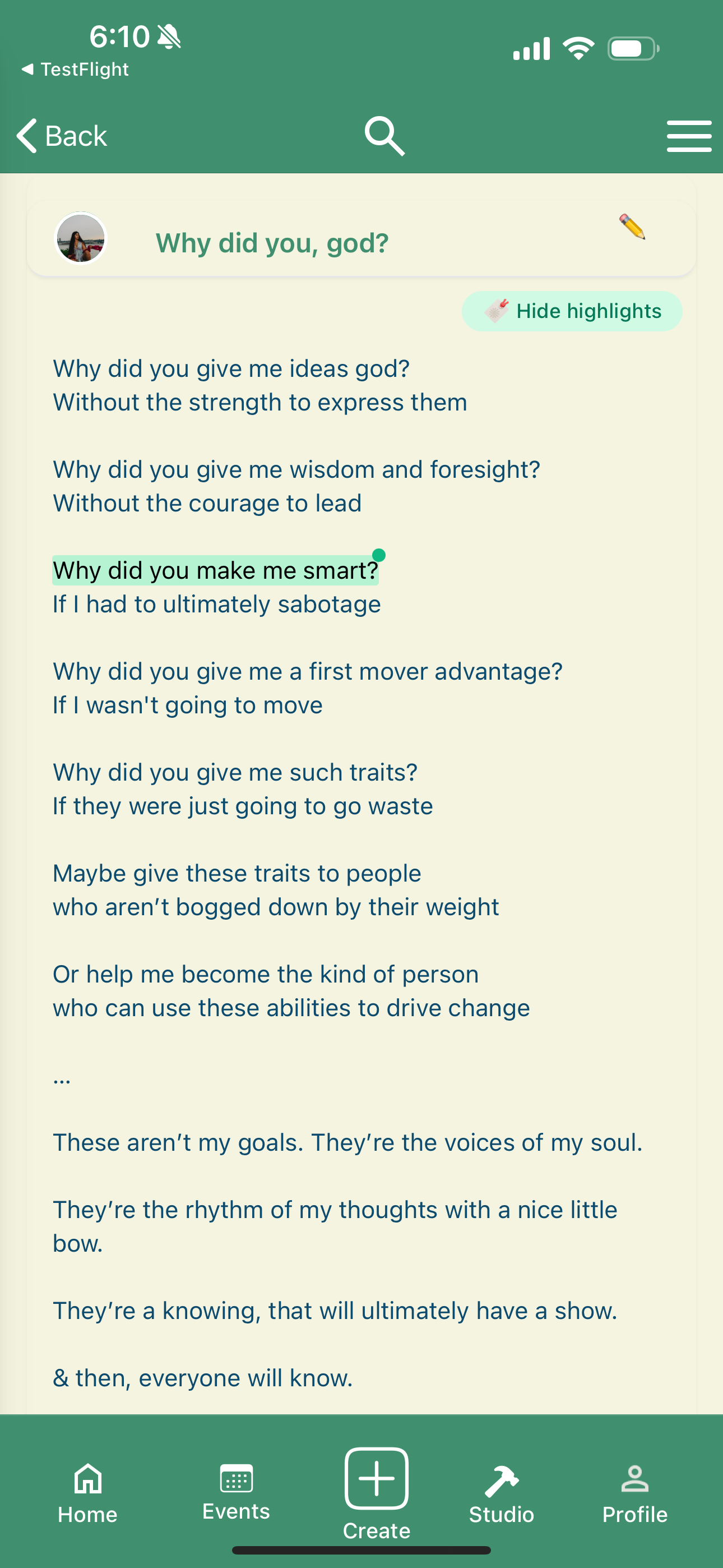
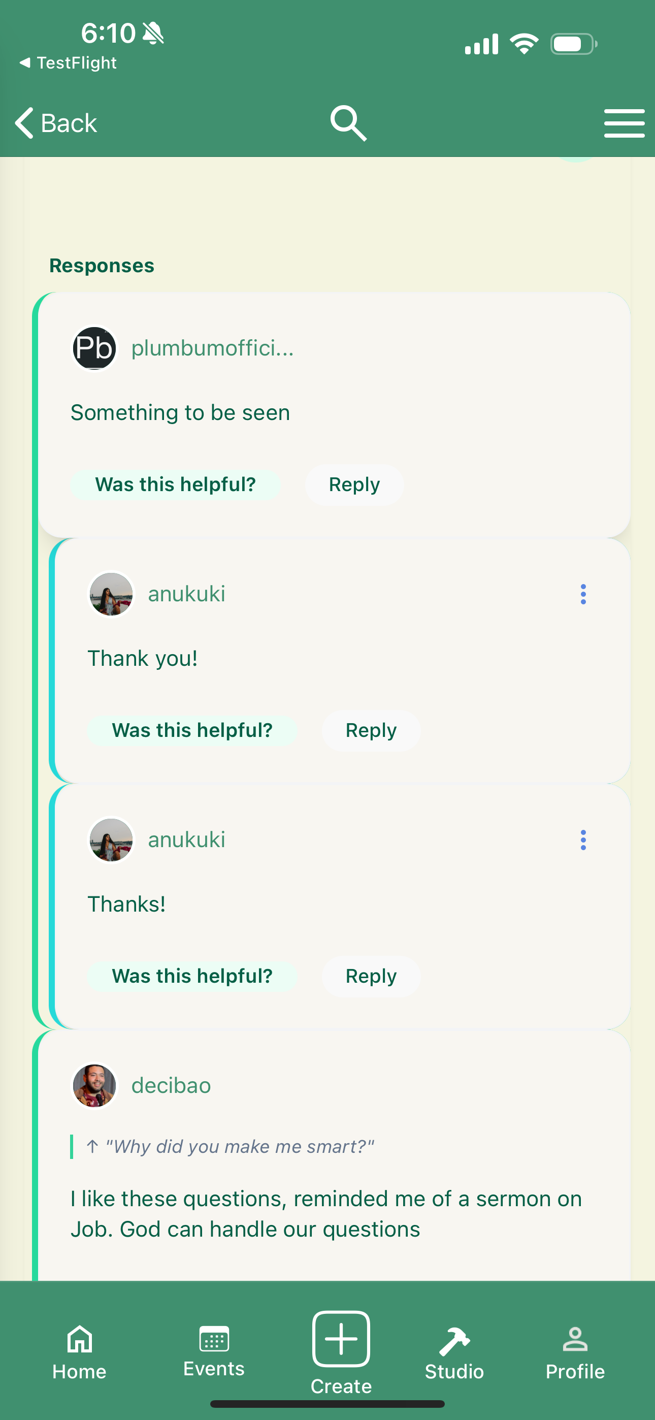
| Poem reading view with line-level highlight + pencil annotation pin. “Hide highlights” toggles the layer. This is the direct answer to Insights 2 and 3. | Threaded responses with “Was this helpful?” micro-feedback on each comment — quietly enforces the “honest, constructive” community norm. |
5.4 Create flow — explicit draft states
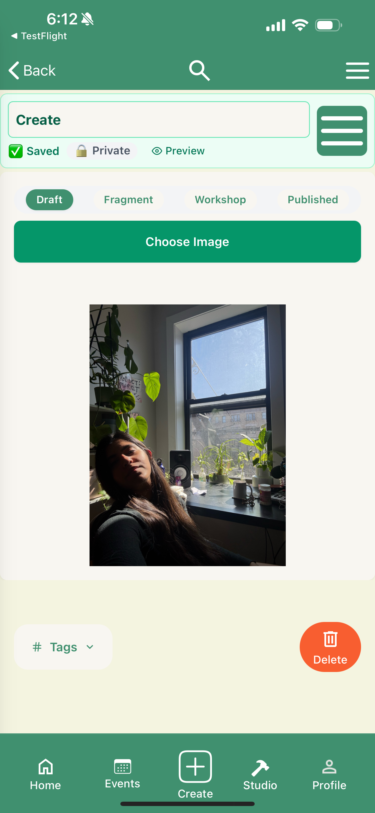
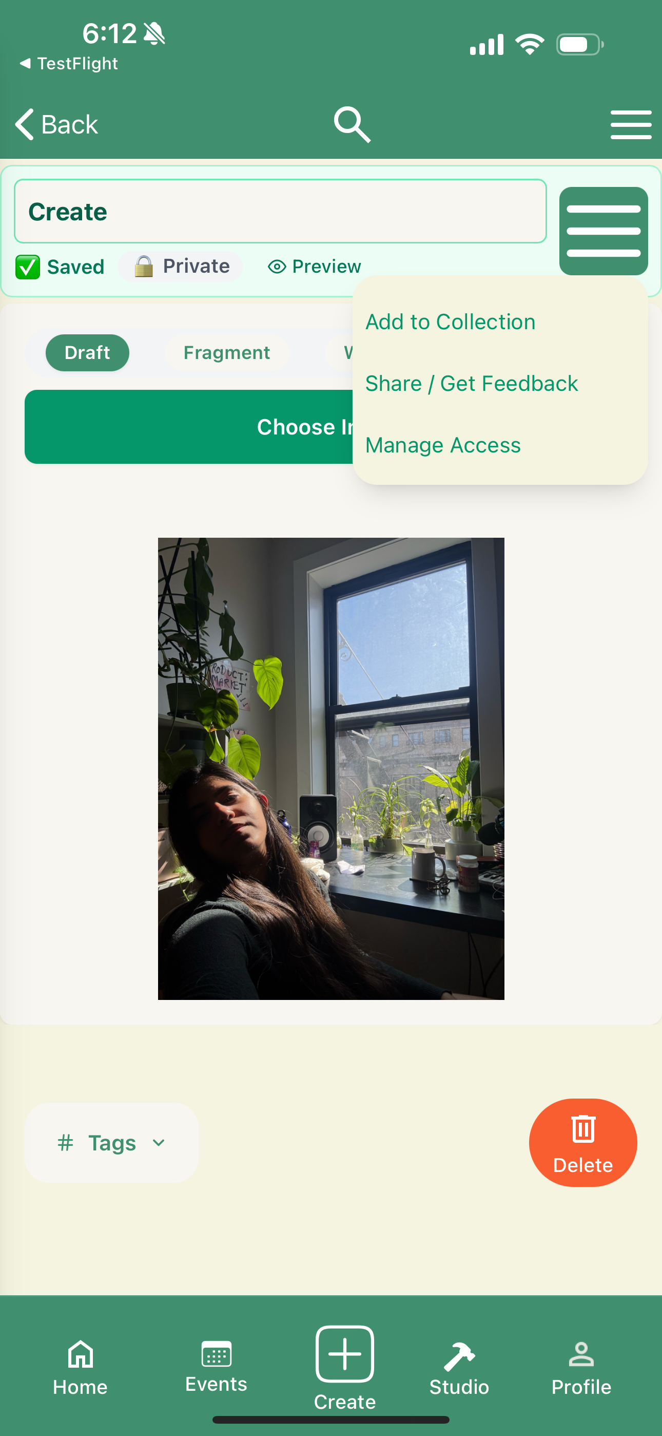
| Create: title + status row (Saved · Private · Preview), state tabs (Draft / Fragment / Workshop / Published), and an image picker. State is visible at all times — no guessing where a piece lives. | Per-page actions menu: Add to Collection, Share / Get Feedback, Manage Access. The verbs match the insights, not generic CRUD. |
5.5 Profile and primary navigation
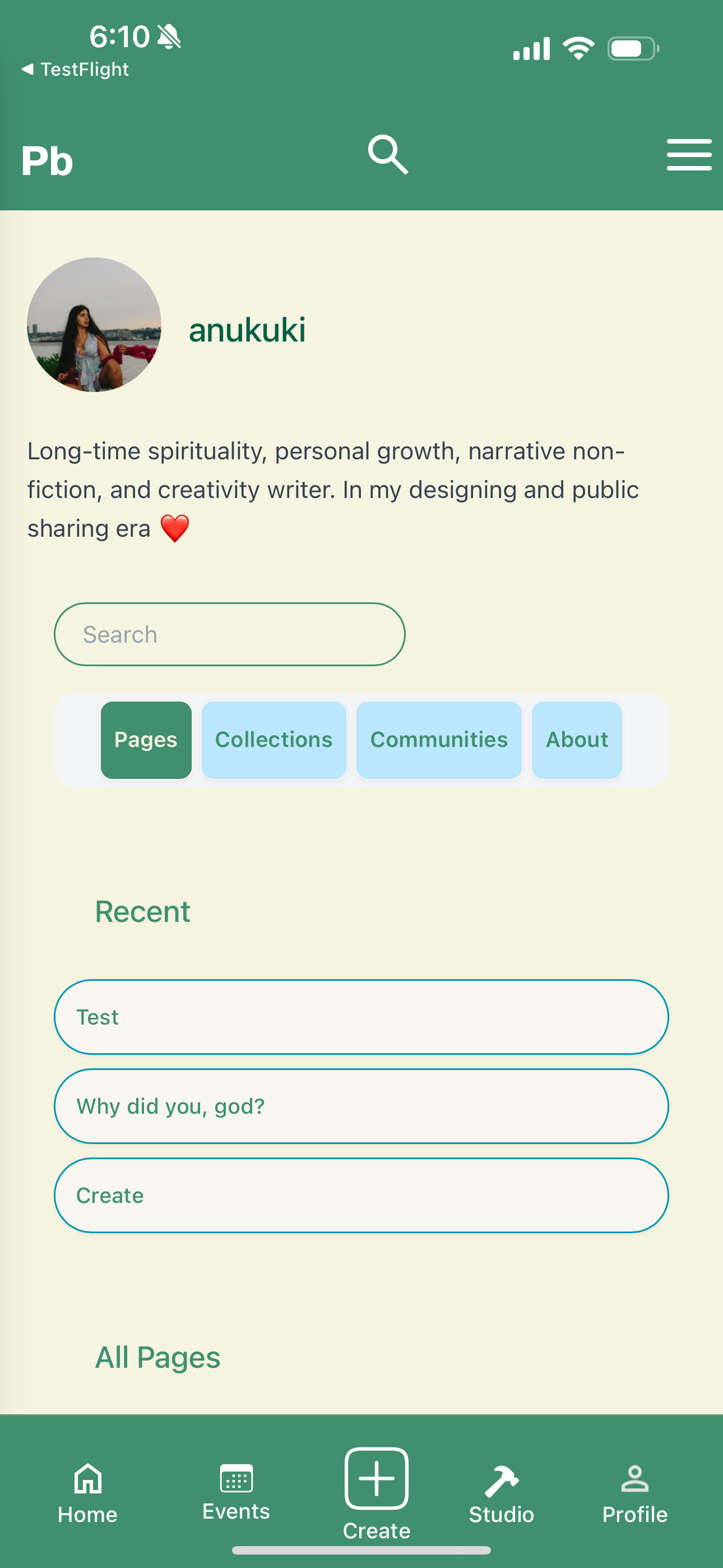
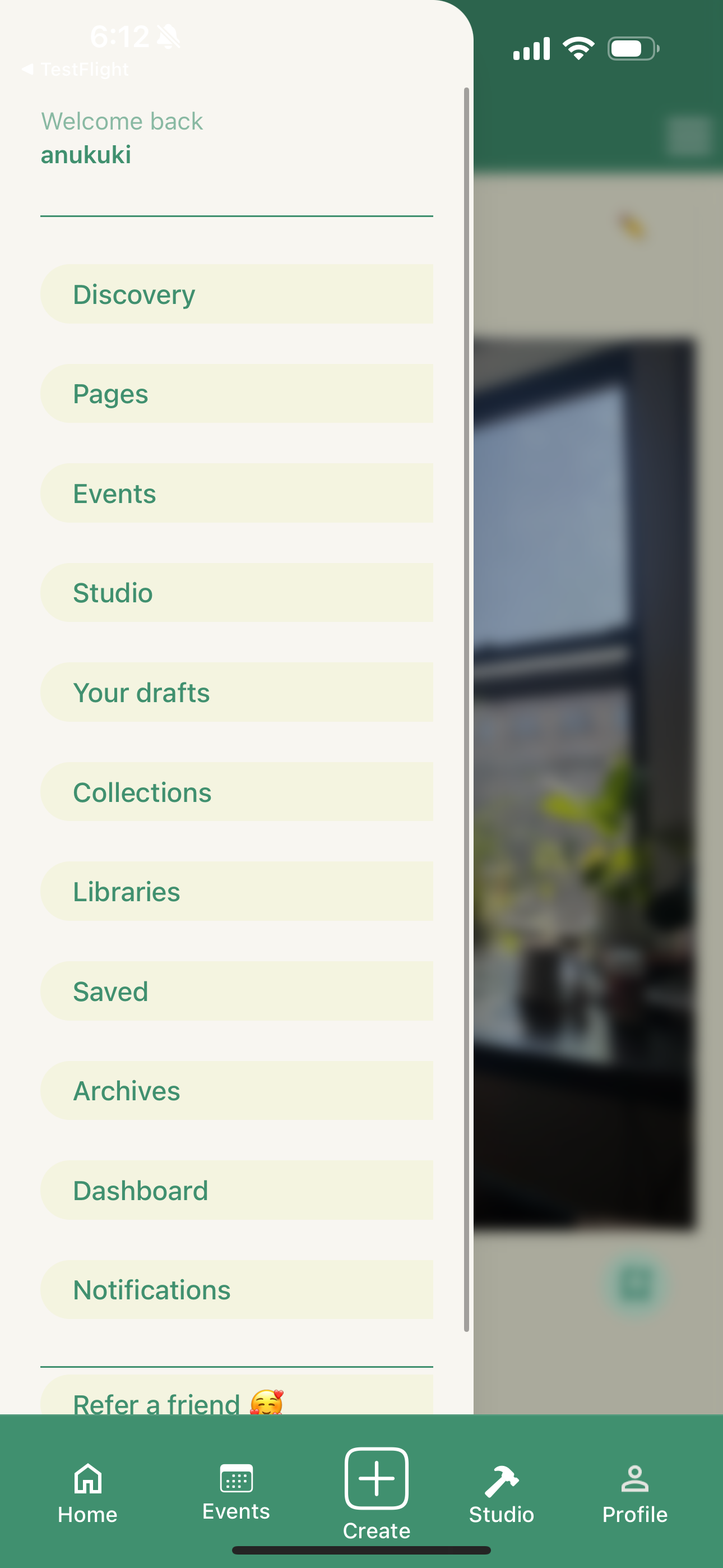
| Profile: avatar, voice-led bio, search, and Pages/Collections/Communities/About tabs. “Recent” over “All Pages” — reduces effort to get back to in-flight work. | Primary nav drawer — the full IA in one column: Discovery, Pages, Events, Studio, Drafts, Collections, Libraries, Saved, Archives, Dashboard, Notifications, Refer a friend. |
4 Events — hybrid by neighborhood
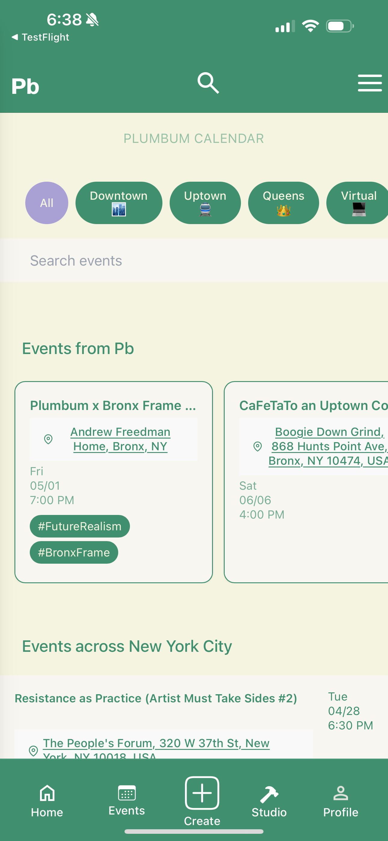
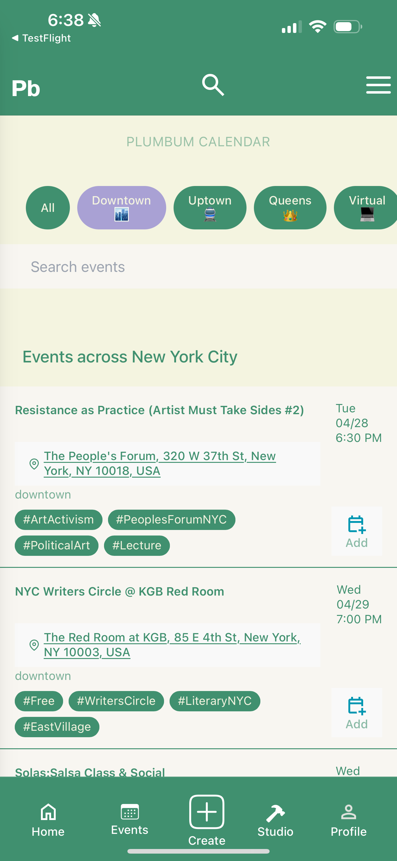
| All events: NYC neighborhood filters (Downtown, Uptown, Queens) + Virtual. Hybrid by Design isn’t a feature — it’s the IA. | Filter applied: Downtown view. The same calendar surface, different scope. |
6. Reflections
What worked
- Embedding the survey inside the application form gave me higher-quality data than any standalone survey would have produced — and zero net cost to the team.
- Coding open text into themes (rather than relying only on multi-select) gave me language I could lift directly into UI copy: “What’s happening in your communities,” “Writing prompts for you,” “Get feedback.”
- Splitting Home and Dashboard late in the process — even though it added a tab — was the highest-leverage IA decision I made.
What I’d do differently
- I would have run two short usability sessions on the mid-fi onboarding before locking the gate copy. The “If you’re approved on the website, log in here” screen still confuses some users on first launch.
- I’d test a non-card layout for the prompts feed against the current cards — prompts feel more like “invitations” than “content,” and cards may be reading as the latter.
Skills demonstrated
- Research design: embedding research instruments inside production surfaces.
- Synthesis: coding open-text responses into design implications.
- IA: defining a domain taxonomy (Pages, Collections, Libraries, Workshops, Archives) and stress-testing it against real workflows.
- Visual systems: building a coherent green-on-cream identity that worked across reading, writing, and social surfaces.
- Interaction design: line-level annotations, draft state model, hybrid-event filters.


 anupriya kukreja